







I was a lawyer
10 years in law taught me to see every side of a problem and trained me to predict scenarios
Location: Georgia, GMT+4,
open to relocation
There are hidden layers behind my work as a product designer. Some of them came from unexpected places, but they now help me solve product problems in a more thoughtful way


10 years in law taught me to see every side of a problem and trained me to predict scenarios
I worked with many different people and learned to notice what they really mean, not only what they say. This helped me become more attentive to context, motivation,
and hidden needs
A product designer shaped by all these layers. They help me understand people, predict scenarios, ask better questions, and turn complex logic into clear product flows
Product designer, project work
Distributed network scanning platform
for large and dynamic scopes
Product designer, part-time
Online web service for analyzing trading history (50 000 users)
Junior product designer, traineeship
Global cybersecurity company with around 400M users and customers in 200+ countries
I’m drawn to products where the interface
has to make complex logic feel clear: core flows, changing states, dense data, and decisions that shape what users see next. Recent projects include security, trading,
and analytical platforms across mobile and desktop
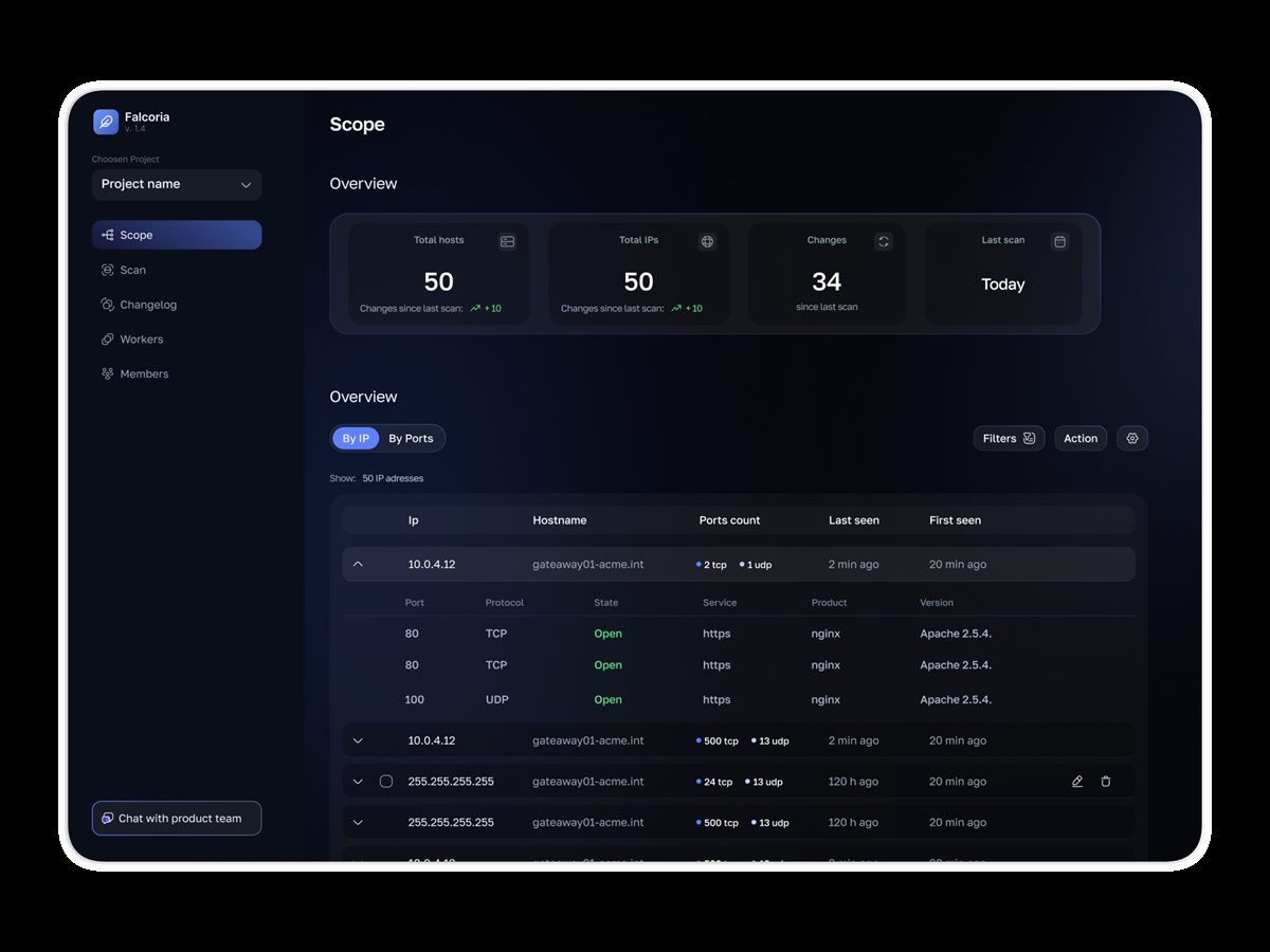
B2B platform for pentesters and security teams - distributed network scanning with shared results and full change history
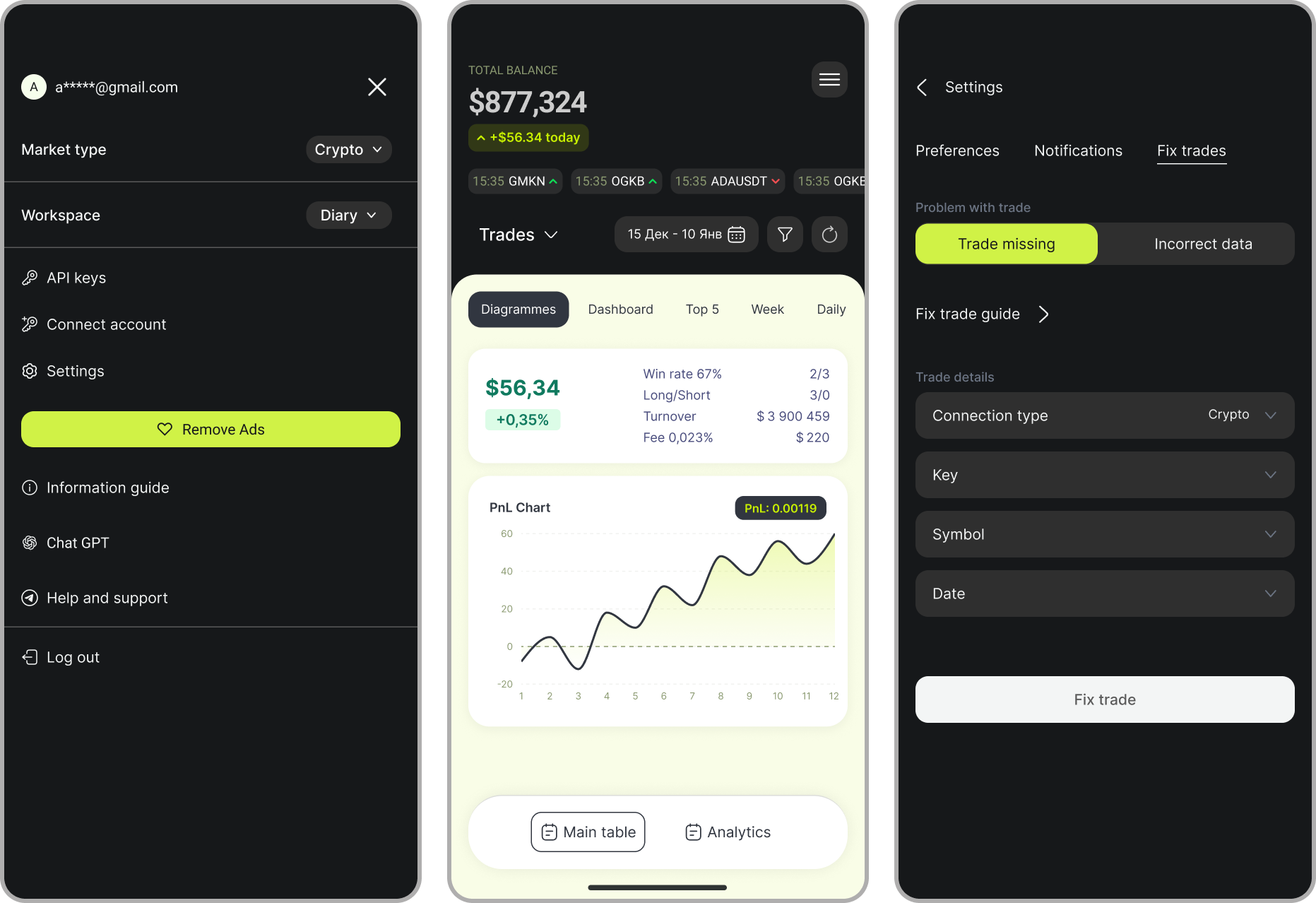
A web service that allows to analyze trades, discover trading patterns and gain insights
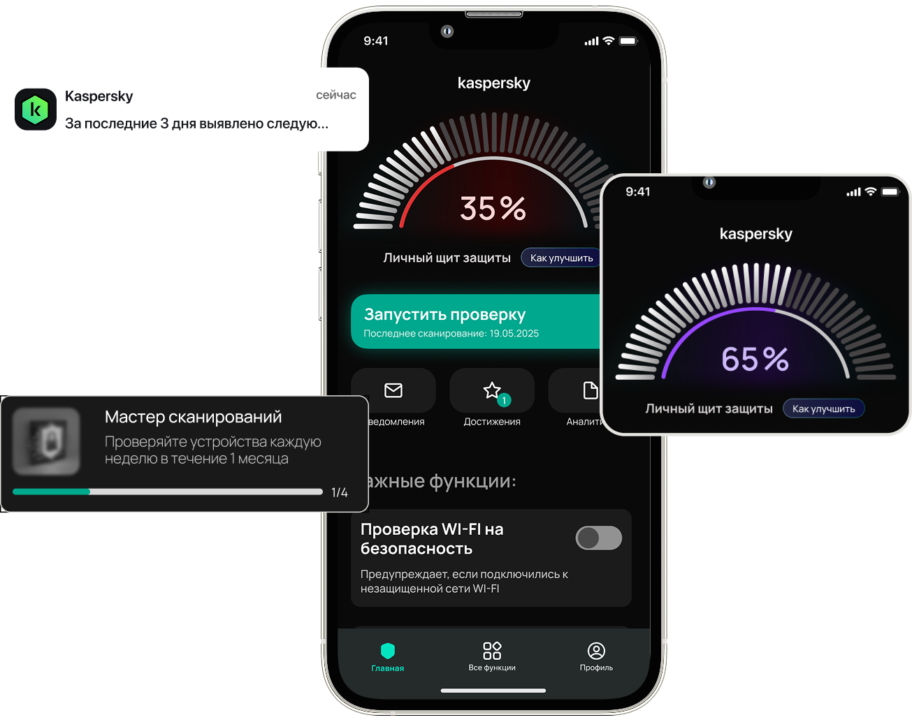
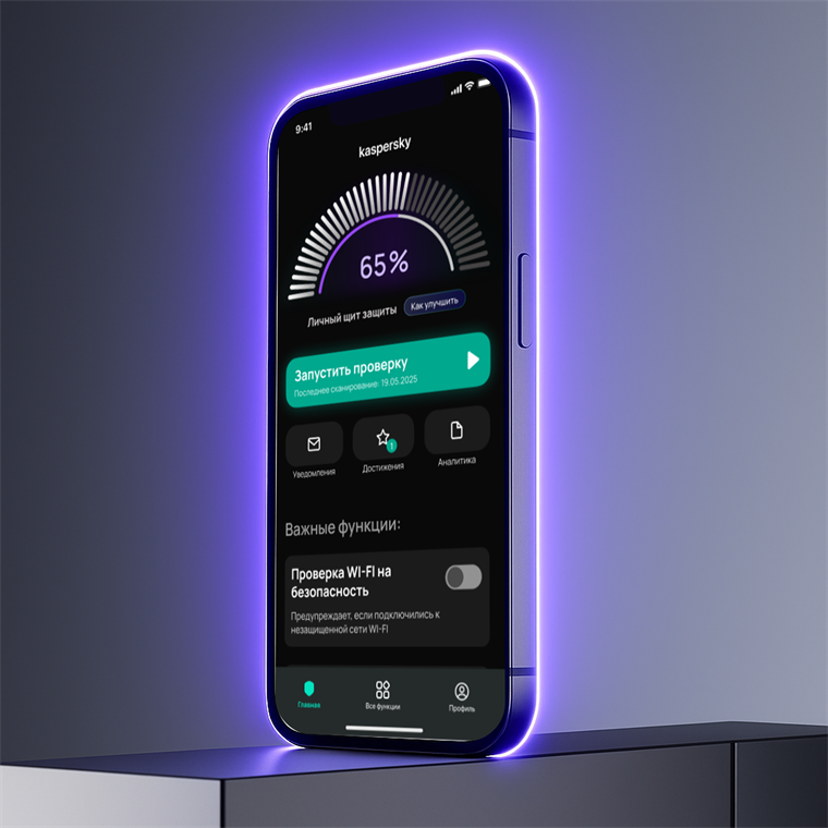
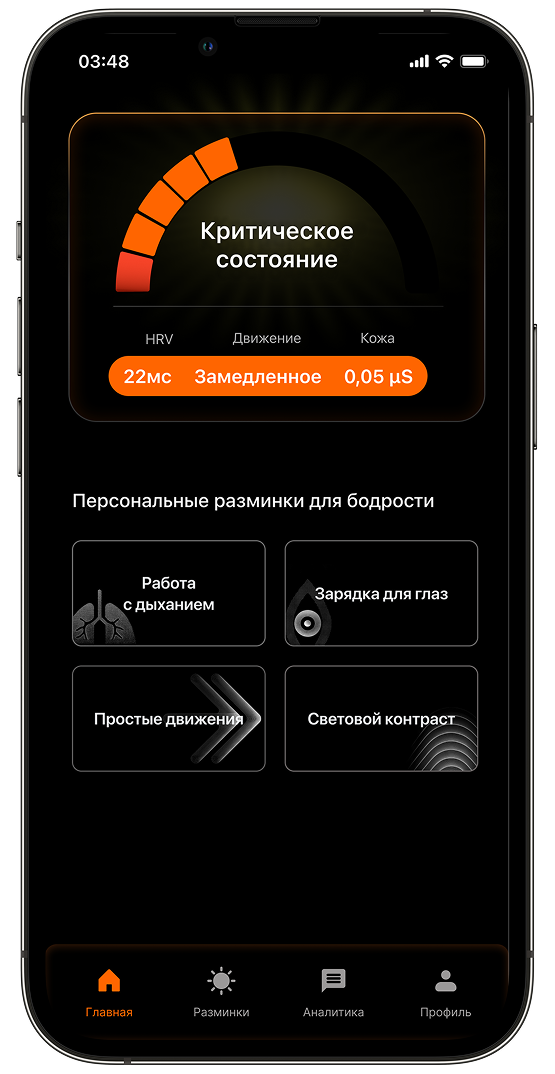
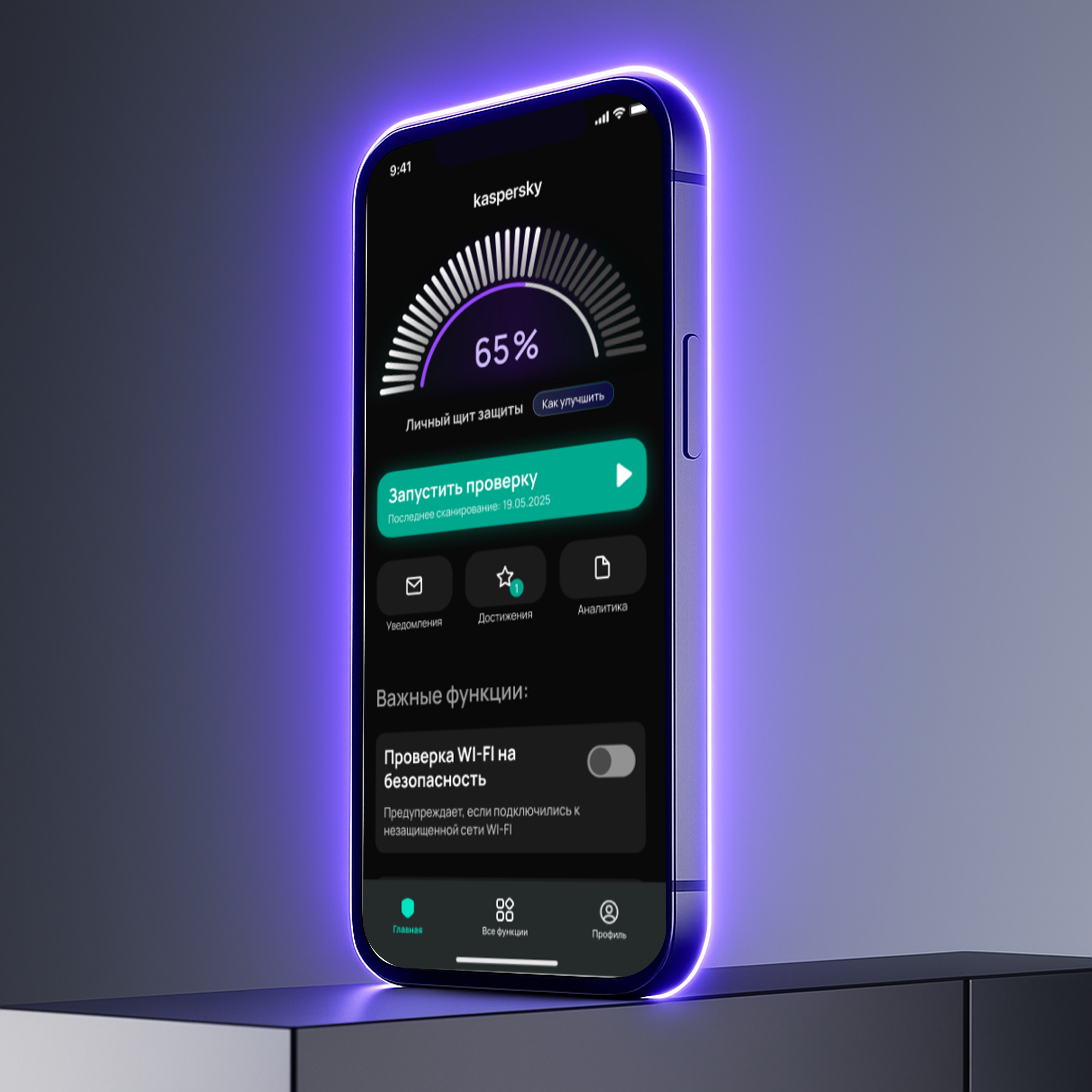
Mobile security app redesign focused on clearer protection status, faster checks
and smoother onboarding




Platform for security teams
that automates network scanning.
Pentester submit targets — IPs, domains, or IP ranges
and platform runs
the scans, collects the results,
and keeps everything in one shared
database. Instead of managing nmap files manually, whole team sees
the same up-to-date data with change history tracked automatically
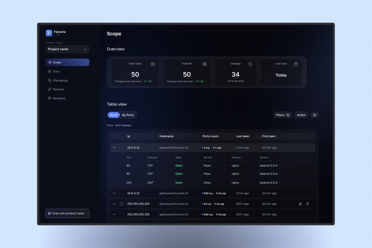
Falcoria is a platform for security teams
that automates network scanning. Pentester submit targets — IPs, domains, or IP ranges;
the platform runs the scans, collects the results,
and keeps everything within one shared database. Instead of managing nmap files manually, whole team sees the same up-to-date data with change history tracked automatically
working alone on a complex cybersecurity platform, where the interface depended directly on the technical logic of the product
Products in this space rarely have public design references. I borrowed interaction models
from adjacent domains such as BI platforms
and database management tools
Our users already knew the tools better than we ever could. The interface had to support their expertise - not explain it
Users wanted to see everything at once.
The challenge was fitting more information
into one screen without making it harder to read
Destructive actions were part of everyday work, but they still had to feel safe enough
to prevent costly mistakes
 Where I focused
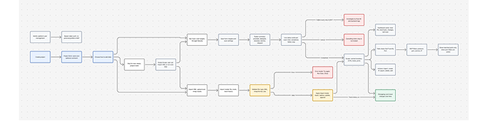
I focused on the moments where users could get confused or make the wrong decision: how to add data, which import mode to choose, whether to track history, what to do after an error,
and where to check the imported results
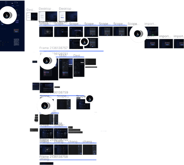 Structuring the workspace
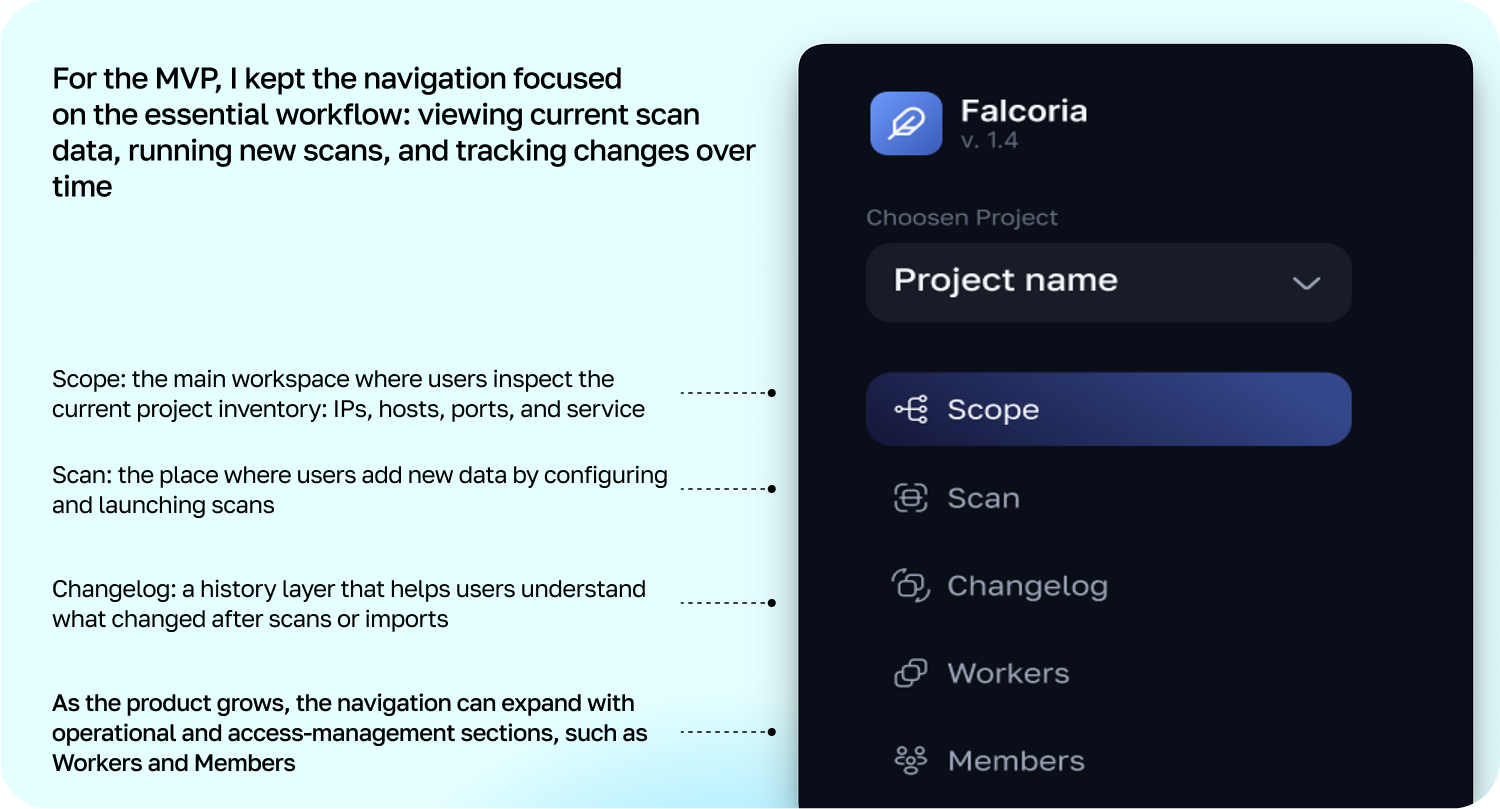
For the MVP, I kept the navigation focused
on the essential workflow: viewing current scan data, running new scans, and tracking changes over time
 Starting a project
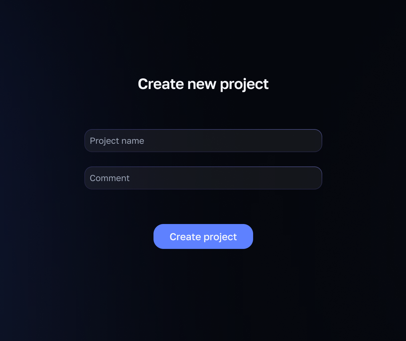
A new project has no data yet, so users choose how to fill it. Each path required a different UX logic.
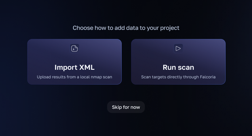 Import XML
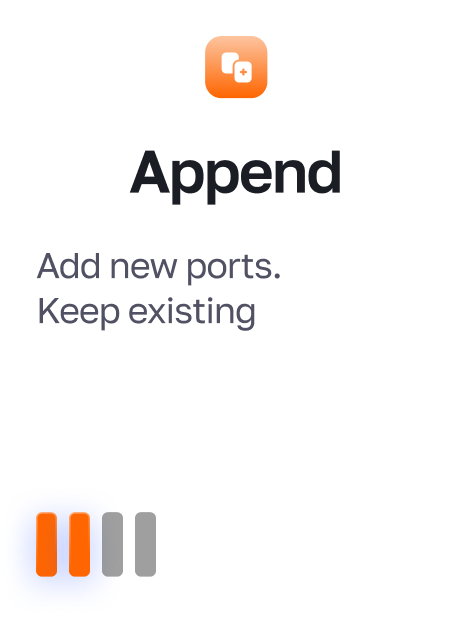
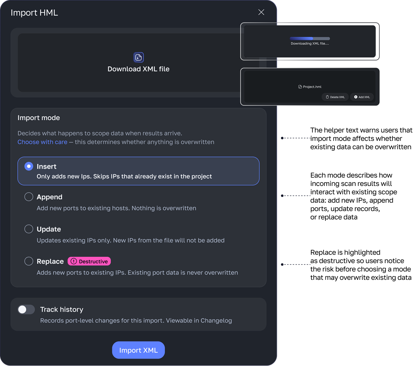
Import XML required extra care because uploaded data can change existing Scope records. The modal had to explain update modes, highlight destructive options, and let users decide whether this import should be saved in Changelog
 Run scan
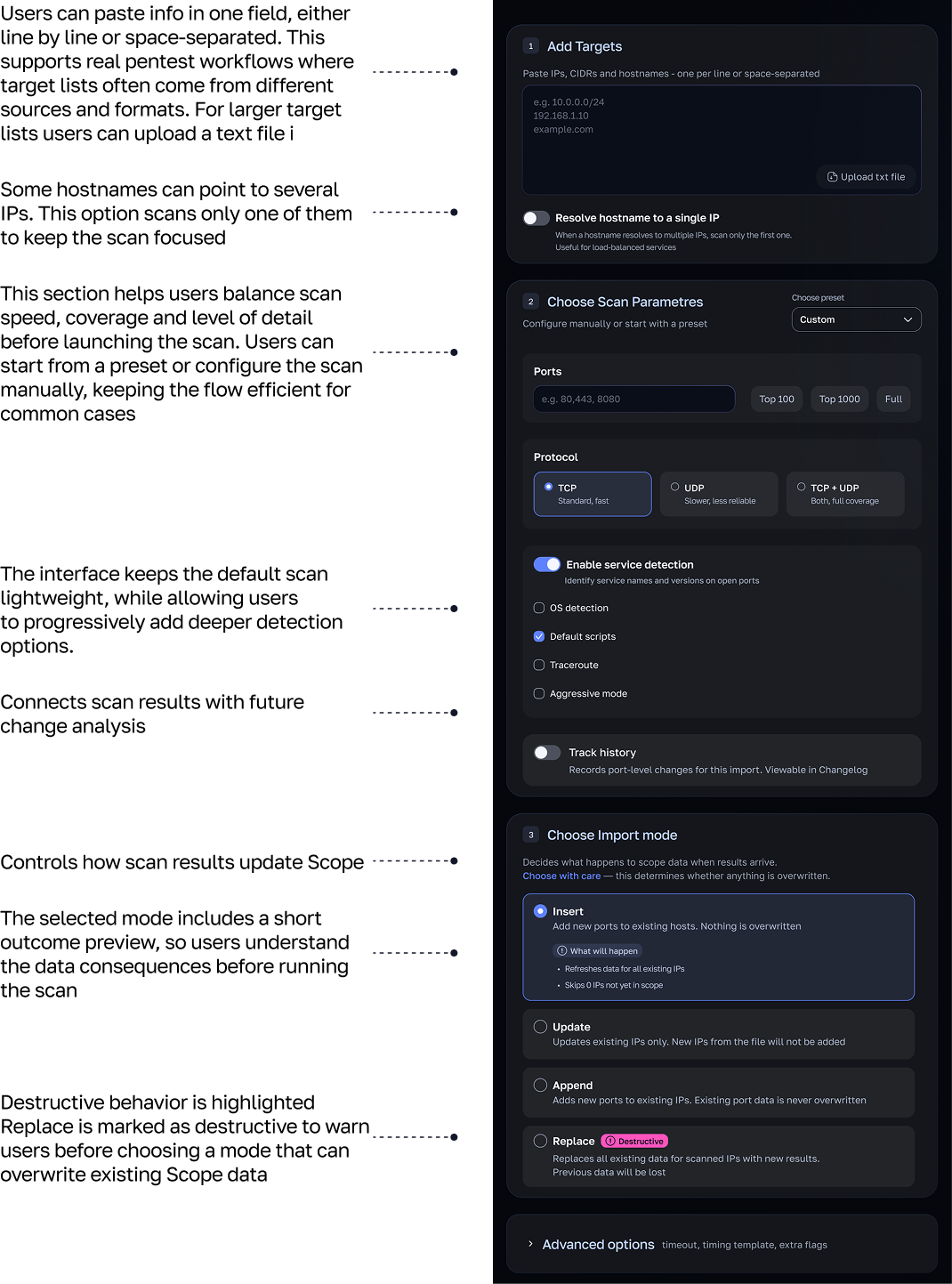
Run scan required a different structure. Before launching a scan, users need to define what
will be scanned, how deep the scan should go, how new results should affect existing data,
and whether changes should become part
of the project history. The page works as a guided setup, not just a form
 Current state vs. history
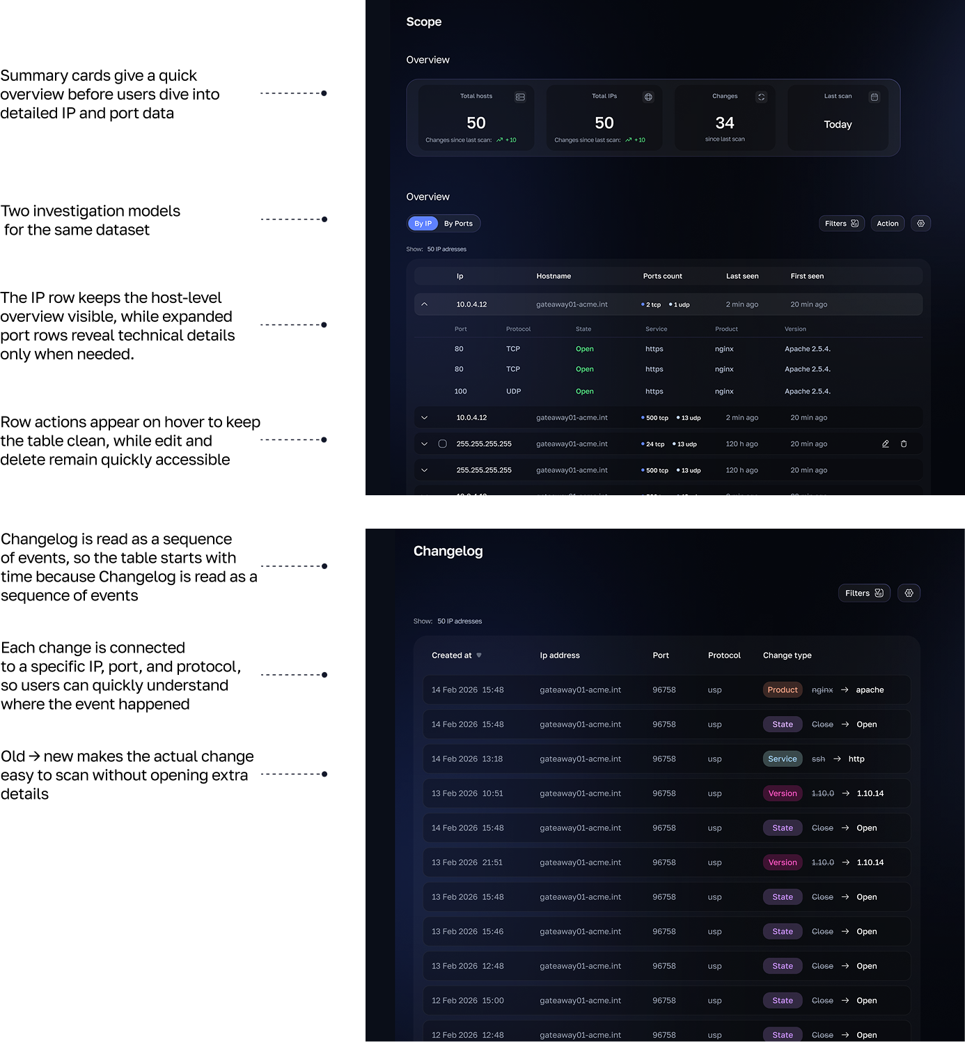
After import or scanning, the data moves into the product's main working area. I divided it into two levels: Scope shows the current state
of the project, while Changelog shows changes over time. This lets users analyze the current network structure separately from tracking what changed after new scans or imports
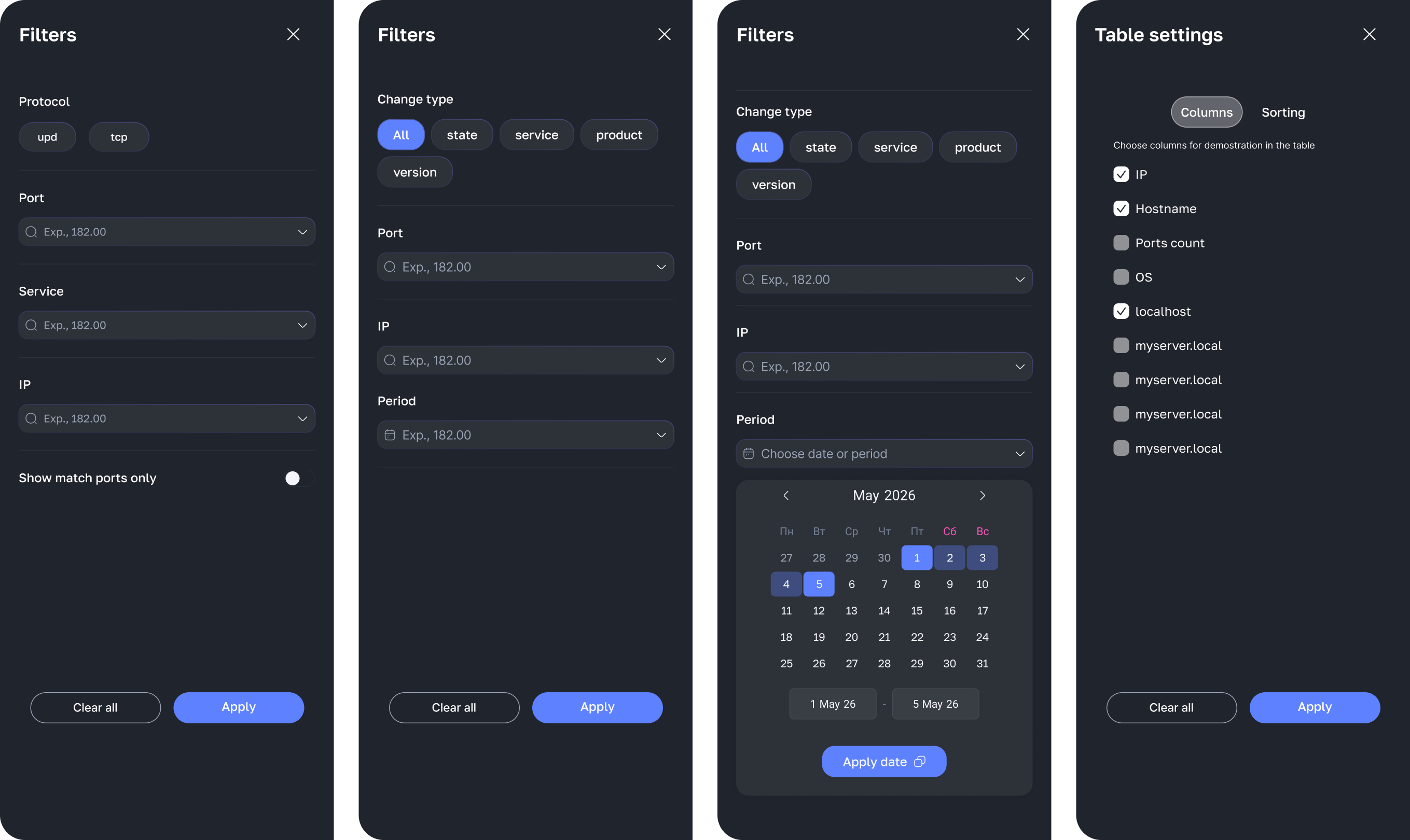
 Filter system
Scan results can become very large, so filters were designed to help users quickly narrow the table to the most relevant IPs, ports, services,
or changes. For the MVP, I prioritized the filters that help users narrow the data fastest, while keeping less critical fields outside the first version. Column settings reduce visual noise, hiding fields that are not relevant to the current task
Falcoria is not a simple dashboard. It works with technical scan data, background processes,
imported files, and history. My job was to make all of that understandable without hiding the details that
security users actually need. I focused on the moments where users could get confused or make
a wrong decision: how to add data, which import mode to choose, whether to track history,
what to do after an error,
and where to check the imported results
A new project has no data yet, so users choose how to fill it.
Each path required a different UX logic. Import XML is about bringing existing scan results into the
project safely. Run Scan is about configuring how new results
will be generated inside Falcoria
Import XML required extra care because uploaded data can change existing Scope records. The modal had to explain update modes, highlight destructive options, and let users decide whether this import should be saved in Changelog
Run Scan required a different structure. Before launching a scan, users need to define what
will be
scanned, how deep the scan should go, how new results should affect existing data,
and whether changes
should become part
of the project history. The page works as a guided setup, not just a form
After import or scanning, the data moves into the main working area of the product. I divided it into two
levels: Scope shows the current state
of the project, while Changelog shows changes over time.
This lets users analyze the current network structure separately from tracking what changed after new scans or imports
Scan results can become very large, so filters were designed to help users quickly narrow the table to the
most relevant IPs, ports, services,
or changes. For the MVP, I prioritized the filters that help users
narrow the data fastest, while keeping less critical fields out of the first version. Column settings help
users reduce visual noise by hiding fields that are not relevant to the current task.
One of the most valuable parts of this project was using the product team's dedicated AI workspace. Instead of digging through documentation, I could ask questions, explore technical concepts,
and quickly understand how the product worked
This was one of my first opportunities to build
a product from scratch — mapping user flows, defining interaction logic, and shaping the UX before moving into UI
I became more confident discussing technical constraints, using design tokens, and making decisions with implementation in mind
2023
2023
2023

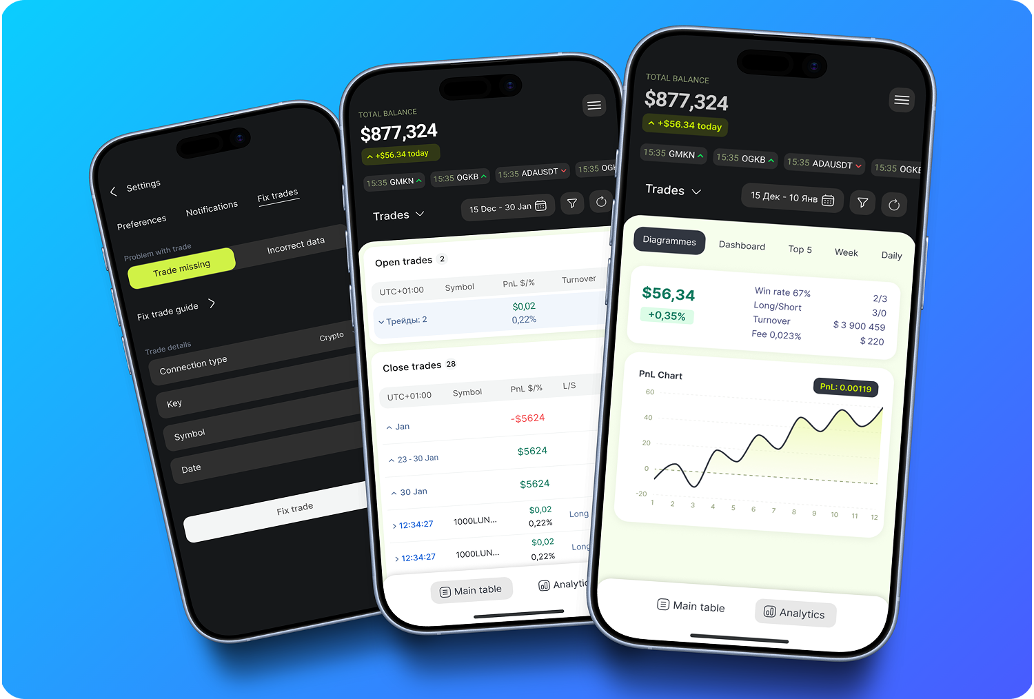
In 2025, I joined as the only designer on Trader's Diary — a web-based trading journal and analytics platform that automatically imports trades, visualizes them on charts, and helps traders review their performance and identify trading mistakes. Besides changes in UX logic, my main task was to build the mobile version of the platform
Because of technical and business limits of the platform, the UI shown in this case is different from the real product. But all user scenarios, logic, and order of interactions are kept exactly the same as in the real product
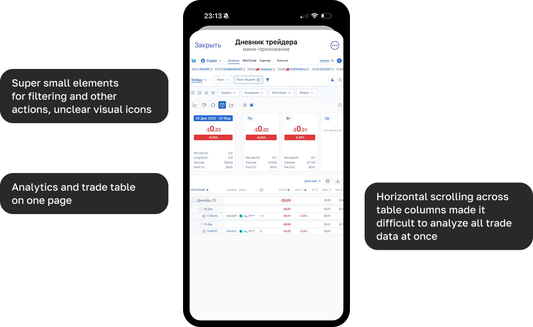
The mobile version basically didn't exist — it was just a scaled-down web. More and more new users were entering the service for the first time from mobile devices, but their sessions were short and users went back to desktop, because using a complex product with so much data on mobile was really hard
The goal was to rethink the current logic and interface, and turn the mobile version into something close to a real mobile app (lay the foundation)
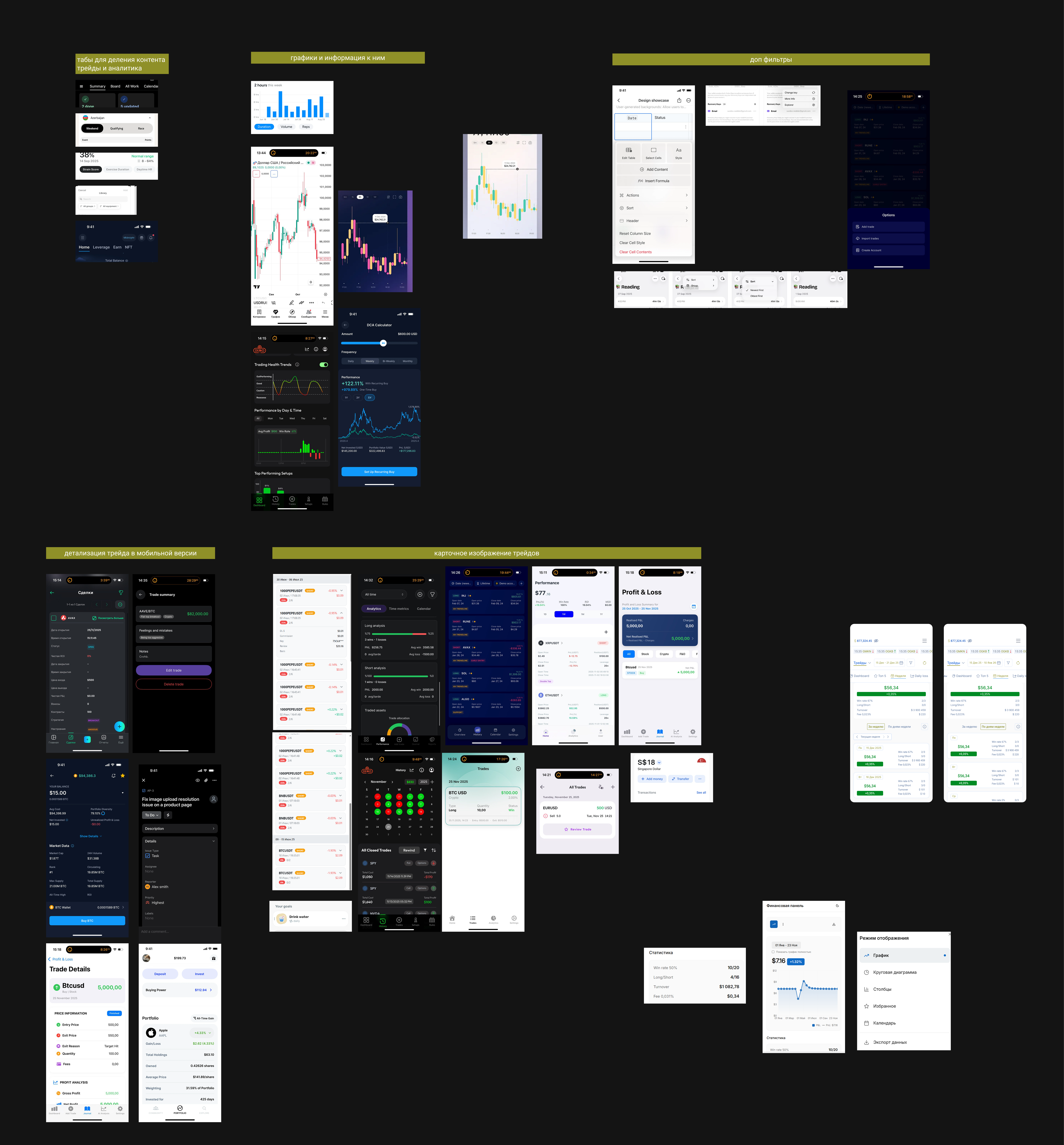
I analyzed a wide range of market solutions, including not only analytics platforms for traders focused on reviewing past and closed trades, but also mobile products with more complex table-based structures. This helped me identify the most suitable visualization patterns and interaction logic for presenting complex trading data in our mobile version
preserve analytical speed in a constrained mobile interface
Dense trade data
Table-to-chart context
Fast mobile navigation
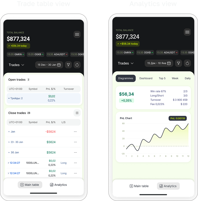
On desktop, the analytics, charts, dashboard, and trades table can live next to each other. On mobile, this approach created overload: users lost reading speed, and the link between a trade, its chart, and its details became less clear.
So I suggested splitting the main modes into "Table" and "Analytics" — to keep fast access to the data and avoid mixing different scenarios on one overloaded screen
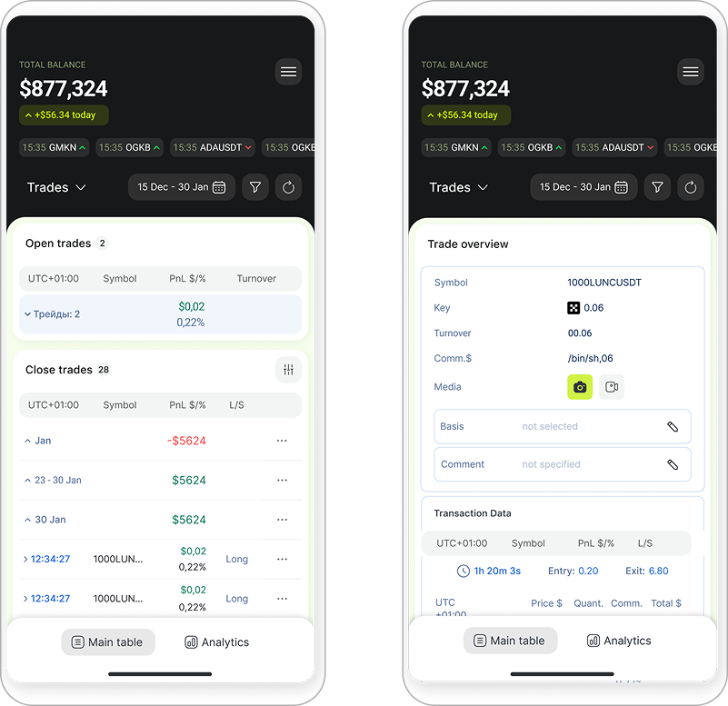
Desktop could show a table with 13 trade parameters. On mobile that's too much, so I picked only the key parameters for the main screen. The rest opens on tap on the trade
“Even though many apps use trade cards instead of a table, I decided to keep the table view on the trades page, because:
— either the card got too big and the user would have to scroll a lot to look through several trades,
— or we'd have to add a tap to expand the card anyway”
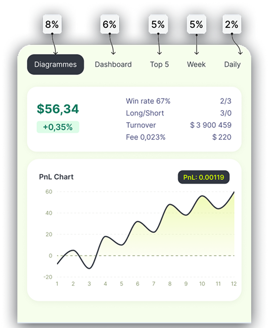
The horizontal tab bar structure is based on click-through conversion data. Analytics sections with the highest number of user clicks are placed at the beginning of the tab bar, while lower-engagement sections are moved further to the right. This helps keep the most relevant dashboards visible and easily accessible, even when part of the navigation is hidden
Click-through conversion rate
by analytics type
Markets and trade type moved into a popup (used less often, so this saves space)
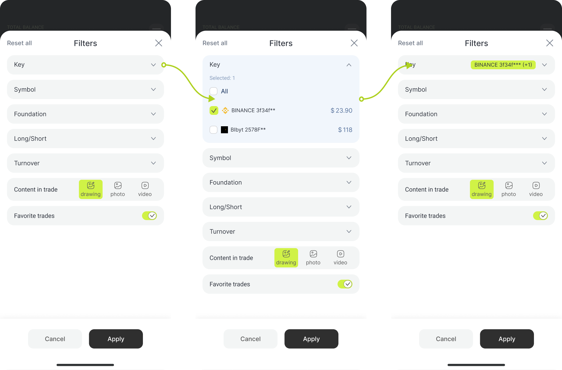
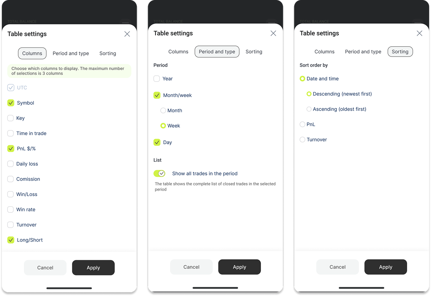
Turned the table filters and settings into clean, easy-to-use popups
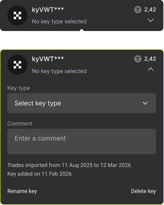
For example, because of the small mobile screen, the block with API keys was hidden — secondary parts were tucked away, keeping only the main ones visible
Web version
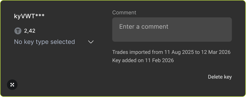
Mobile version
Although the updated mobile version was released recently, early conversion data already shows a positive trend. These results are preliminary
and may change as more data is collected